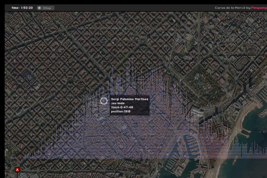
Visualizing data in the “cursa de la Mercè” 2009 on the map of Barcelona.
The visualization shows the path of all participants (approximately 8500) with accelerated time, doing rollover on any of them shows their name, gender, final position in the race, and travel time. Upon reaching the goal (marked as A) it shows up the Gaussian distribution (typical) based on the number of arrivals per minute.